Native
The context
Native was shifting from a serviced apartments model to focus on Aparthotels, opening up new locations that were more hotel, less apartment. They wanted to offer the amenities you expect in a high-end hotel, but with the flexibility and space of an apartment.
What we did
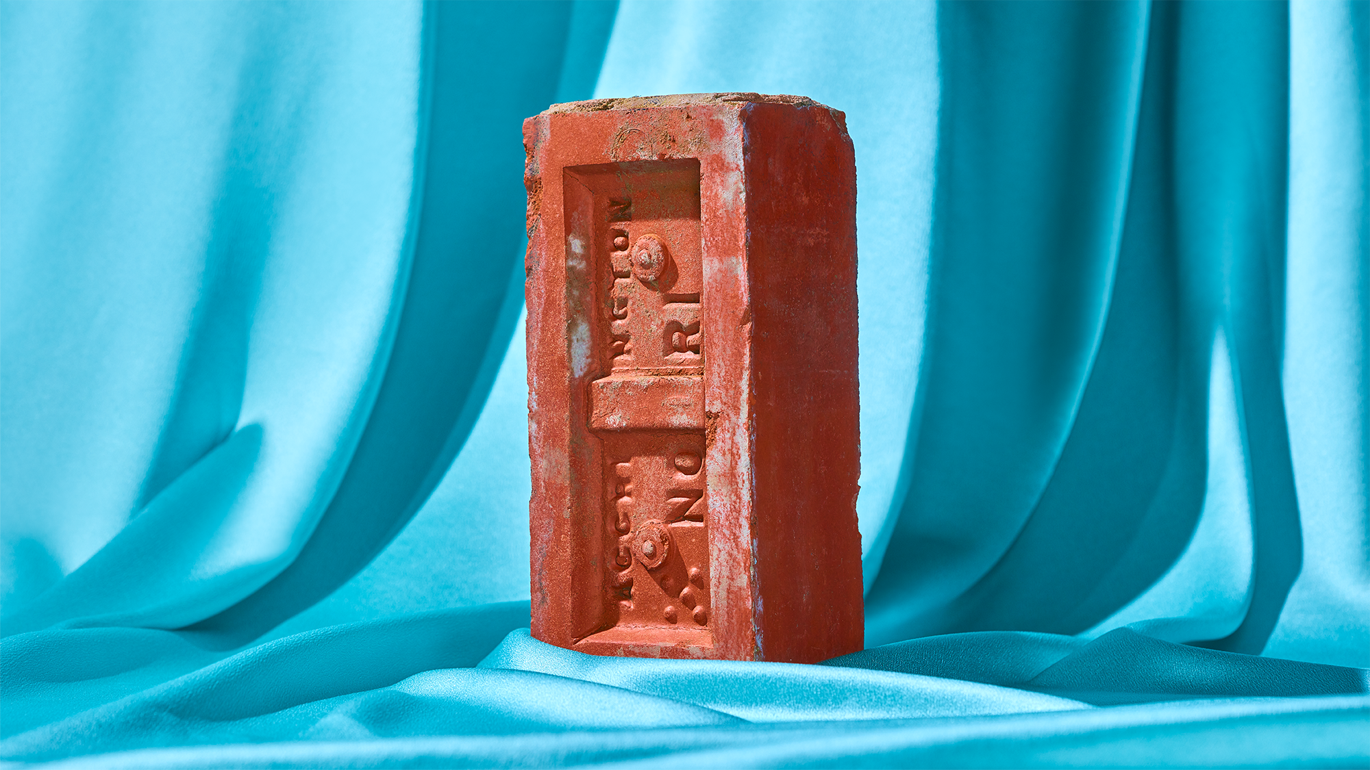
The brand we created highlights the flexibility of being able to have the best of both worlds. This direction led us to design the Native ‘N' logo, which flexes to incorporate different locations and activities, depending on the communication. As a result, the ‘N''s diagonal line became a motif for the brand.
For each site, the visual system is consistent, but the art direction changes to reflect the tone and vernacular of the location.
Native was shifting from a serviced apartments model to focus on Aparthotels, opening up new locations that were more hotel, less apartment. They wanted to offer the amenities you expect in a high-end hotel, but with the flexibility and space of an apartment.
What we did
The brand we created highlights the flexibility of being able to have the best of both worlds. This direction led us to design the Native ‘N' logo, which flexes to incorporate different locations and activities, depending on the communication. As a result, the ‘N''s diagonal line became a motif for the brand.
For each site, the visual system is consistent, but the art direction changes to reflect the tone and vernacular of the location.
My Role
Creative Director, Onwards Agency
Collaborators
Photography, Matt Davis
Creative Director, Onwards Agency
Collaborators
Photography, Matt Davis